Slight rant, but I feel like phone interface design keeps getting worse rather than better.
We don't have to go back to skeuomorphism of the old iphones, but whenever I use my phone I have no idea what's tappable and what's not. There's even this trend now of not making it obvious what's even a text box or what's not. It /looks/ nice, but it's infuriating to use. And then you have the weird gestures that are completely undiscoverable. Like pulling down from the top right to get the utility menu thing. I mean, yeah, I know it's there, but I never would have actually discovered that on my own. Also now there's this trend of just hiding everything to make an app look minimalistic and simple even though it's not. So I have no idea what it can even do when I look at it. And I /still/ have no idea how to properly line up apps side by side on my iPad. I mean I kind of do, but I constantly forget, and worse, once I do have them lined up, it's hard to get rid of them. It's all insanely undiscoverable.
I wish UX designers would realize it's not all about being pretty, you have to actually give people an idea of what things actually DO. All the clunky old interfaces with the bevelled buttons and huge scroll bars and stuff might have been ugly as sin, but at least they weren't a constant confusion.
I think this is partly why older folks often say something along the lines of "you young people are so /good/ at technology". We've had so much exposure that we've built up a mental model of how even non-intuitive / hard to discover things should work. Sometimes when I update my phone after a number of years or try and operate someone else's phone when they ask for me to "fix this problem" it's hard because of that exact problem, I don't know where or how to access the thing I want.
But it's not all bad; you can't put heaps of buttons on a mobile interface because of the limited screen size and lack of precision with pressing them, so some amount of 'magic' and hiding is necessary imo.
I thought about that, why was I good at technology relative to my parents? It was because I had no job, and little responsibility, so I had the free time to go through every single setting in the control panel and see what it did, or every single setting in my phone and poke around, and it was only after spending that time that I actually became 'good at technology.'
In contrast to my father, who gets off work and tries to do something with his computer and has an issue. It's simply faster for him to call me from my room and have me, whose invested tens of hours poking through all the pokable things already to solve his issue. Simply put, between working, commuting, being an adult, etc, my father had no real time to invest this time in pure discovery, when what little precious time he had as an adult had to be divied up in the most valuable way.
I see that now as an adult, free time is precious. You don't have the time to learn like you did as a kid, when you could just throw 8 hours at something. I barely find the time to play my guitar for a half hour a day between working and being exhausted after the working day. I can't imagine having to learn how to use a computer, at this age. I simply have no free time to invest in such with all the other things life throws at you to prioritize, and what free time I do have I'm mentally tapped at that point, and I fully expect in a few decades at this rate to become a technology dinosaur just like my parents and grandparents were.
Symbols on fuckin' telephones. I still cannot reliably answer telephones; growing up in a world where picking up the handset was to close that circuit and answer the call, the need to pick up the handset and then operate fucking buttons is still such a pain. I get it, there has to be an operation, because the phone could be in any position and any orientation at the moment of the phone call, being used for something else. But still.
These things have huge resolution now and the user can pick their language; would it really kill them to write words over the little icons? If in English, perhaps "ANSWER", "HANG UP", "MUTE" and so on, but the magic of words is that it doesn't have to be those exact words ("HANG UP" and "END CALL" are completely different sets of words yet in the context of a phone call, mean the same thing to almost everyone - magic).
Words. They carry so much information. So much. I know, people want to find some magic picture that carries full meaning to all cultures, but there simply ain't no such picture and there never will be; there's no shame in using words. Please. Use words. I'd even happily take them in a language I don't even speak, so long as it used an alphabet I could read (or even not - I can read some common software related words in Japanese simply through having sounded them out a few times). For me at least, words are easy; the ever-changing mist of icon-style-du-jour is not.
Along these lines, I admit with shame that lately I’ve been switching to airplane mode before looking up or modifying a contact, because it’s not obvious to me which combination of symbol-labelled buttons will do this without initiating a phone call. I feel old.
And don't get me started on trying to click on a missed call to either find out more about the number, access the voice mail or simply get rid of the "new notification" dot. I more often than not start calling the number although that's the last thing I want to do.
My favorite was UI of a smartphone where a Hangup button when pressed will end a call and will display a contact screen of the other party with a Call button exactly at the position where the Hangup button was. So when you are about to end the call and the other side hangs up first, at the moment you pressed the Hang up button, it has turned into Call button and instead of hanging up you actually start to call them back.
I'm in the "text or GTFO" team, and the opposite is an especially annoying trend in desktop webapps. My bank rewrote their UI to icons-only a while ago and it's complete shitshow. I randomly click around to go to the screen I want because icons are non-descriptive at all.
Having said that, text has an annoying feature of needing to be localized, and localization of button texts is tricky because you want a very short string, in order to not overflow, because you have very small screen estate on mobile.
(It doesn't also help that some native built-in components have APIs that show the icons only, without text)
This. It is confusin for me as someone who grew up with internet. We have a huge screen, use it. Geez. Forget about my parents and older relatives trying to figure out how to hangup. I miss the green and red buttons on Nokias..
There is no creativity any more. Everybody is too busy following apple
What I definitely don't want is four almost identical icons with nothing to tell me what any of them do, or swipe gestures that are impossible to discover, or (the worst) swipe gestures that expose icons.
And then, the absolute worst of all, the useless "upgrade" that offers zero additional functionality, but changes the location or design of all the icons of an app that you've already learned.
A few weeks after I got my first touchscreen phone, I had to google for how to answer it.
I had assumed you'd just tap the "answer" button, but that failed more often than not. It never would have occurred to me to swipe a minimum of 3cm, starting with the answer button, and I must assume this knowledge has spread to users by osmosis rather than discovery.
The accept button animates on most phones in the way you need to move it. But it's true that I've seen many first timers get confused, probably because of the inherent pressure that accompanies a phone call.
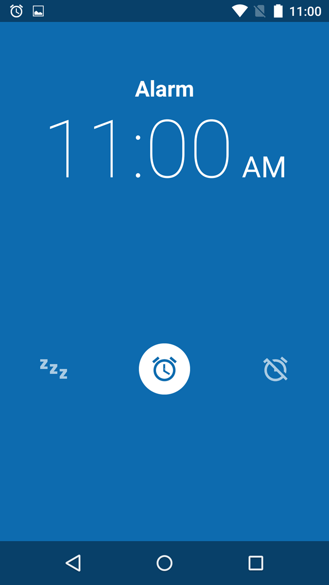
I'm on stock Android using the stock Google made Clock app for my alarms and I still sometimes need to double-take and make sure I'm not snoozing instead of turning my alarm off.
This[1] is what it looks like when the alarm goes off. (Swipe left to the "zzz" snooze icon or swipe right to the off icon). I can't always rely on muscle memory because I am not always consistent in which direction I put my phone down on the nightstand. This is not the best UI for a person who has just been woken out of sleep and still groggy.
There is also plenty of room to replace those three icons with "Snooze" and "Stop Alarm" buttons. Plenty of room even for multiple snooze buttons of varying duration. There is a downside to the button approach, though. I have one app that uses buttons to snooze or stop the alarm and I almost always touch some random one when I'm pulling the phone out of my pocket. That's why I like some apps that use buttons that have to be held down for a second or two to register for certain actions.
Phone interfaces are a minefield for me for some reason. It's too easy to accidentally push a button you didn't realize was a button when you were trying to scroll down the screen but pressed it too hard when you did so. I run into lots of pitfalls like this. I grew up in the era where the OS interface was a "READY" prompt, so I've seen most of the paradigms out there over the years. Nothing has annoyed me as much in recent memory as having a touch-sensitive interface on a slick, compact phone with rounded edges that I desperately don't want to drop.
There is a solution, but at this point, I think no vendor has the guts to apply it.
The solution is:
1) Publish Human Interface Guidelines that detail a rich set of standard gestures, how various tappable elements MUST be marked, and how they SHOULD be arranged.
2) Publish abridged HIG for end-users as a part of user manual for the device/platform. Aim for closed-world reasoning, i.e. the user must be able to build a mental model of, "if I can't see this functionality here, here or here, it does not exist", and not "it may be hidden somewhere else".
3) Tell app developers to stick to the HIG or GTFO.
I know, wishful thinking.
The decay started long, long ago. The other day, someone commented on HN with a link to a piece of old Microsoft WinAPI documentation, I think Windows 95 era or older, where there was a side note on window styling and "escape hatches" that unfortunately had to be built in, because marketers are marketers and desperately want to fuck up usability to put branding on things. Back then, platforms already gave away too much control over styling to software vendors (where originally this control resided with end-user).
You know, by the Win 95 era the GUI toolkits would take descriptive code informing what kinds of interactions you can have, and automatically add the correct markings and widgets.
It's interesting that nowadays, with all the work gone into sandboxes and frameworks, nobody seems able to do that.
Nobody cares to do that. Declarative UIs, where you describe what is being represented and what can be done with it, and the framework styles it up for you - these are desirable by developers and users, but not by people holding the money to pay for development.
The best phone UX experiences I've ever had was swiping/multitasking on BlackBerry 10 OS. I wish Android liberated it.
- Swipe from bottom to wake.
- Swipe from bottom whilst inside an app, peaks all open apps, once let go it fully minimizes the app. During a peek you also see the number of unread notifications on the left.
- Swipe from left to go back.
- Swipe from bottom, then to the right to access the BlackBerry hub, which aggregates ALL emails/IMs/notifications in a single list (can be customized into groups).
- Swipe from bottom left corner towards center hides on-screen-keyboard.
- Top swipe displays app specific option/help/misc links.
- 2-finger swipe from top revealed quick settings (wifi, flashlight, etc). No notifications here (they're in the hub)!
- Not swiping, but it had a clean, single unified location for all app notification/permissions/etc which feels much easier than Android.
I feel if BlackBerry released the Q10 2-3 years earlier we would have had a totally different phone ecosystem today. I still miss it.
> The best phone UX experiences I've ever had was swiping/multitasking on BlackBerry 10 OS
It's a pity more haven't experienced the useful aspects of BB10's interface (10.3.2 IIRC was when it received a much appreciated UI appearance update, fwiw).
I've tried Android, iOS, Windows Phone and BB10 is still my favorite. Windows Phone in particular was surprising in how unintuitive various of the gestures were in comparison.
As a side note, on their phones with a physical keyboard (which featured touch detection on the surface of the entire key array) text interactions were much improved. Finessing text selections was particularly easy compared to using the touch-screen. Double-tapping the keys (without depressing them) brings up the loupe and from there one can hold down Shift while gliding around the keys to adjust the selection, much like a laptop with a touchpad.
It doesn’t sound like most of those gestures are particularly discoverable though, which is sort of what the parent comment is complaining about when highlighting widgets that don’t look like widgets. There are lifesaving bits of UI in iOS for example that I didn’t know about for years, like holding the space bar to get directional control of the cursor. I like that it exists but I don’t feel that good UI can be something you not only have to be told how to use, but didn’t even know it existed.
They were discoverable, though. It boiled down to "swipe up from the bottom to go home, swipe down from the top for settings", and at first start-up it forced you to perform these two actions before setting you free.
Swipe left to go back worked anywhere (you didn't have to start from the edge of the screen) and dynamically showed the page being pulled off the stack, so it was super discoverable. All of the swipe gestures worked this way—"peek" was core to the interaction model because it made users feel in control, and let them cancel an action by just dragging back to where they started.
The two-finger swipe from top was only to bring the system quick settings while in an app (the two-finger gesture was also only added late in the OS's life, at the behest of power users); the quick settings were available on the home screen with a single swipe. While in an app, a single swipe brings up the app's settings.
The only non-discoverable gesture was swiping the corner of the keyboard to dismiss it, and it was also totally useless. The advertised way to dismiss the keyboard was by long-pressing the space bar (there was an icon showing this).
I suppose it was this bottom left swipe I was really picturing, and I will admit my experience of iOS colours my enthusiasm for invisible bits of UI in general. I can accept it's possible to have a small pool of gestures and still allow users to build a strong, consistent mental model of how to interact with a device.
A tutorial on first use is probably not enough to have most users remember the gestures or even just which options there are. Maybe spaced repetition would be a better approach.
There were really only two gestures you had to learn: swipe up to go home, and down for settings, and these are fundamental to using the device (so very hard to forget). Pretty much everything else came naturally.
On the home screen, swiping down gave you the system quick settings, and in an app it gave you the app's settings, so the two-finger gesture was just a power-user shortcut to the system quick settings while in an app.
Swipe left to go back was very discoverable, and worked differently than iOS or Android, because the entire OS was built around the idea of stacks of pages. Swiping left was just pulling a page off the stack (fluidly animated and cancellable, and you could start anywhere on the screen). There was also a back button on the left-side of the toolbar that you could tap to do the same thing.
Swipe up and to the right to go to the notifications Hub was also discoverable. The Hub was the left-most page on the home screen, so "up-right" simply combined the gestures into one fluid gesture; it was also totally optional.
Black and white low resolution interfaces were great exactly for this reason.
512 x 342 x 1 bit color created some pretty fantastic usability.
I've wanted a modern consistent, monochrome interface for a while as a general computing interface.
I've been looking at the e-ink devices for inspiration.
Forced contrast, forced visibility, it all has to be apparent. I've been hacking lua for this holy grail for about 6 years now, before that in perl, then in C since around 2001 or so.
I've got foot pedals, midi controllers I use for general computing, lots of little hacks. Multiple 4k monitors in portrait mode, lots of hacking with arduino sensor packs. Still not there yet.
Interfacing is the current limitation in computing. I've got 128 cores, hundreds of gb of ram, and no good way to use it other than the current paradigms. There's gotta be something better
I agree and think that a good chunk of the apps I use on an every day basis slowly get worse UI over time.
Spotify on Android is pretty awful at this point. Now I can't tap and hold to get to the context menu anymore, now I have to use the triple dot button. Why remove that? Usability is also pretty terrible. Why can't I load the list view of an album I have saved? What the hell. Same with entire playlists that I have saved and downloaded.
Snapchat (I wish I didn't have to use it, but it's the main for of communication a lot of my peers use) keep changing things constantly when nothing was every broken. Over the past three years, they've changed the order and number of tabs they have at least four times.
Google Photos on Android is also annoying separated IMO. Give me an order by date and an order by album/folder. Please just load the folder structure. I assume they do things the way they do to maximize use of their cloud storage, so it is likely intentionally awful for local images.
The official Reddit app is absolutely awful and slow. Reddit Is Fun (third party app) is, and always will be, my favorite Reddit experience. Clean and fast.
That was kind of ranty, but I just wish UI's were simpler on mobile.
It feels like at the same time they keep hiding functionality the add some very in your face ways of telling you about the functionality or soliciting feedback. "Hey we added a new feature", "Did you find this screen helpful?", "want to make the most out of this app?". Instead of thinking about UX rules and applying them I'm constantly in some sort of AB test or survey when I'm trying to get stuff done.
A couple of examples getting in my way at the moment, the android (or nokia) phone app added a full screen "call your favorite contacts with just one tap" image to the favorites screen. I could do this until they added the obnoxious message, now I have to scroll down to even see them. The other would be netflix constantly AB testing me on whether to show the next episode button or jump back to the home screen, just make a decision, the constantly shifting interface is worse than either option.
I often feel like I’m the only person who likes the sort of extreme skeuomorphism of Apple circa 2007: it wasn’t perfect, but it didn’t have the soulless corporate feeling of flat UI styles.
Skeuomorphism has the problem that everything looks like a photo - it doesn't advertise what's usable clearly either.
The problem with flat UIs is that they're also in the middle of abandoning any conventions on what's interactable as well.
Ironically Windows circa 3.1 and definitely by 95 had this nailed: is it greyed out? 3D? You can interact with it. Not 3D? You can't. 3D but greyed out? It is contextually disabled.
Simple and clear at a glance. What that interface got wrong was the MDI motif - multiple document interface never really worked as well as Microsoft wanted, although if they'd made the leap of making it tiling by default they would've got there.
The worst thing is the new dialer. It's bullshit. It took me an hour to figure out how to paste a phone number into the damn phone. Turns out, you hold your thumb over an invisible UI element and then the paste popup appears miraculously. I nearly threw the damn thing across the room when I figured it out. Throw in a box and remove that headache, although it won't be nearly as sexy I'm sure.
You definitely are not alone - I still love the old school Aqua UI. I just switched to Linux after almost two decades on Macs, and the primary reason I chose Elementary OS and Window Maker (I use both) is their somehow retro look and feel.
> Slight rant, but I feel like phone interface design keeps getting worse rather than better.
In my opinion, my interfaces are getting worse rather than better. I feel like a few years ago, a lot of the major companies hit a tipping point with UI optimization and realized a LOT of what they were doing was unnecessary (and perhaps even costing the business money). Anything that didn't clearly serve a purpose got removed - streamlining for a few core usecases.
I haven't seen iOS in a while, but it's sad to hear that it is going downhill. It seems to me that there's a bit of an echo chamber in phone UI: it's done, and reviewed, by heavy users, who already know how it used to work and take a lot of glitches in stride. Maybe I am trying too hard to explain why everything is two steps away from being good.
I recently got an Android 10 phone, from a vendor I had never heard of: Ulefone.
I was coming from a Sony Xperia compact running Android 8 - roughly the same hardware, except not rugged. I presume Sony polished Android a little bit more than Ulefone did, but even taking all that into account, Android 10 was full of shockingly bad UI "decisions".
First: the Do Not Disturb icon in the pull-down thingy is a but when enabled a appears in the top bar.
Second: Pulling down the pull-down thingy once displays a row of 6 icons with no labels. Pulling twice displays 5 columns of icons with labels. It takes extra planning to rearrange the widgets in 5-column mode such that I get the 6 I want in the first row but also a logical grouping in 5 columns.
Maybe these are Ulefone-isms, but whenever I trip over them I imagine how hard Steve Jobs would have fired someone who put this stuff in front of him.
Just yesterday, I wanted to make a normal voice call to someone I usually contact via WhatsApp. When on their contact page, I couldn't tell which icon would make a WhatsApp call and which would make a PSTN call. The WhatsApp phonecall option appeared with the phone's "phone" icon, and the PSTN option had no icon at all. Both had text saying "voice call".
Oh, and don't even get me started about my Android TV. FFS.
>And then you have the weird gestures that are completely undiscoverable. [...] I mean, yeah, I know it's there, but I never would have actually discovered that on my own
I noticed a lot of UI problems like this when my parents changed from Windows Phone to Android and I had to help them. There are a lot of small actions that make sense if you used Android in the past (since they've been slowly introduced) but are completely bonkers to anyone picking it up now:
- To reject a call, swipe the "Accept call" icon down (this one is particularly horrible);
- To enable Wi-Fi, bluetooth, etc. swipe from the top;
- To dismiss a notification, swipe it to the side.
Another annoying trend is buttons that look like text boxes. Oh. A white rectangle with a gray border? I guess I’m supposed to type there. Nope. It’s a button cleverly disguised as an input.
I wonder if part of this is a business problem, not a UX problem:
- most of those apps with the hidden interfaces have no business being on a pocket computer in the first place
If we stopped playing the game of maximising engagement, and returned to "practical usefulness" as the primary driver for application design, we'd probably make better apps.
It's for this reason that I only ever open my investment account on tablet or desktop. I'm much more comfortable with the full-size dashboard and more visible information architecture.
We don't have to go back to skeuomorphism of the old iphones, but whenever I use my phone I have no idea what's tappable and what's not. There's even this trend now of not making it obvious what's even a text box or what's not. It /looks/ nice, but it's infuriating to use. And then you have the weird gestures that are completely undiscoverable. Like pulling down from the top right to get the utility menu thing. I mean, yeah, I know it's there, but I never would have actually discovered that on my own. Also now there's this trend of just hiding everything to make an app look minimalistic and simple even though it's not. So I have no idea what it can even do when I look at it. And I /still/ have no idea how to properly line up apps side by side on my iPad. I mean I kind of do, but I constantly forget, and worse, once I do have them lined up, it's hard to get rid of them. It's all insanely undiscoverable.
I wish UX designers would realize it's not all about being pretty, you have to actually give people an idea of what things actually DO. All the clunky old interfaces with the bevelled buttons and huge scroll bars and stuff might have been ugly as sin, but at least they weren't a constant confusion.